 Mimity Admin

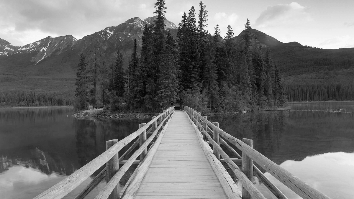
Responsive images
Images in Bootstrap are made responsive with .img-fluid. max-width: 100%; and height: auto; are applied to the image so that it scales with the parent element.
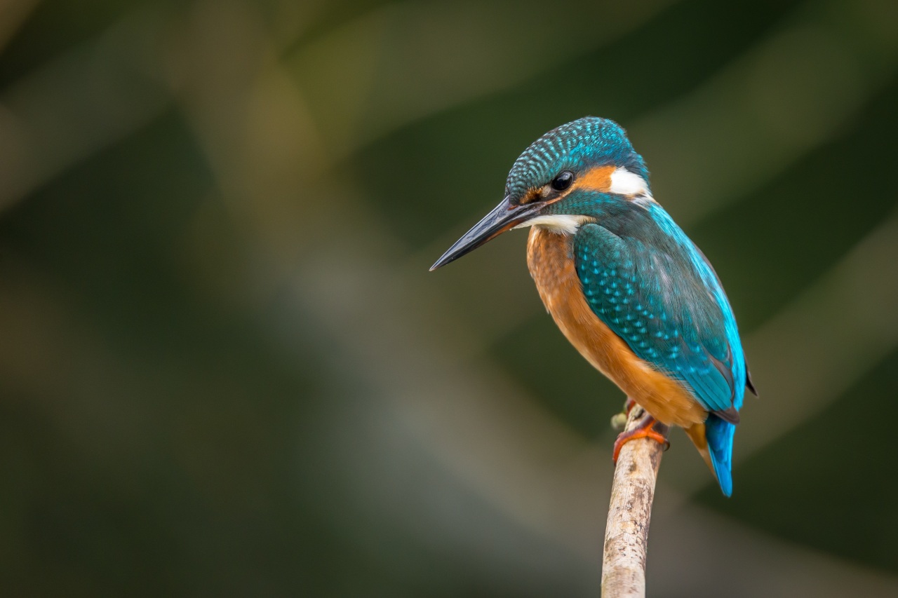
Image thumbnails
Use .img-thumbnail to give an image a rounded 1px border appearance.
User image
Used as a user image, also with online or offline badge.


Background image
Use the image as the background of an element, regardless of the size of the element, the background image will adjust as the background cover
Card title
Some quick example text to build on the card title and make up the bulk of the card's content.
Some linkOverlay & captions
Show Overlay & captions on hover
Gallery
Photoswipe javaScript image gallery for mobile and desktop.
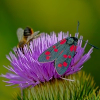
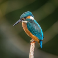
Image comparison
Simple responsive Image comparison